EU and USA Comparison of COVID-19 Cases

It is difficult to make objective comparisons between large geographic regions because here are too many geographic, political, social, and economic differences. In spite of this, we might be able to get some insights about the spread of covid-19 comparing the European Union with the United States because there are some similarities. Both areas are part of the developed world and are socially and economically advanced and both regions are democracies.
Below is a summary as of the end of March:
| European Union | United States | |
| Total Cases | 26,569,680 | 30,393,701 |
| Total Deaths | 614,078 | 550,996 |
| Average number of new daily cases over last 7 days | 167,701 | 66,876 |
| Average number of daily deaths over last 7 days | 2502 | 994 |
| ——— | ——— | ——— |
| Total Cases Per 100,000 people | 5,937 | 9,260 |
| Total DeathsPer 100,000 people | 137 | 168 |
| Average number of new daily cases over last 7 days Per 100,000 people | 37.5 | 20.4 |
| Average number of daily deaths over last 7 days Per 100,000 people | 0.6 | 0.3 |
| Data through March 30, 2021 |
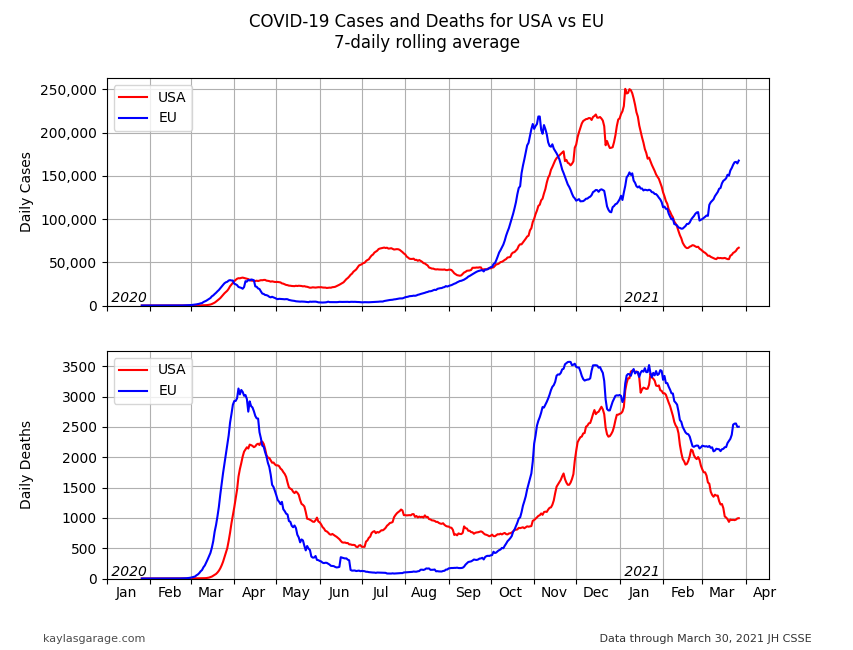
The E.U. saw the first spike in cases and deaths in early March of 2020. The U.S. saw the first spike about 2 weeks later. The E.U. took stronger steps to mitigate the spread (shut-downs, testing and contact tracing, quarantines, etc.) than the U.S. and saw cases and deaths drop to much lower levels than seen in the U.S. through the summer of 2020.
The jump in cases (and deaths) in October and November of 2020 in Europe with the U.S. following 2 weeks to a month later was evidence that we should not have let our guard down. While the E.U. came off its peak of cases after a month or so, E.U. deaths continued to stay high.
It has only been in the last couple of months, January and February of 2021, that the pandemic has dropped off of its peak on a world-wide basis.
There is a troubling trend in increasing E.U. cases over the last month, the U.S. had been 2 to 4-weeks behind the EU, The small upwards tick in U.S. cases may be a sign of an increase to come.

The plots above show total case and deaths for each region. The E.U has a population of about 448 million, he U.S. has a population of about 328 million so totals do not tell the whole story.
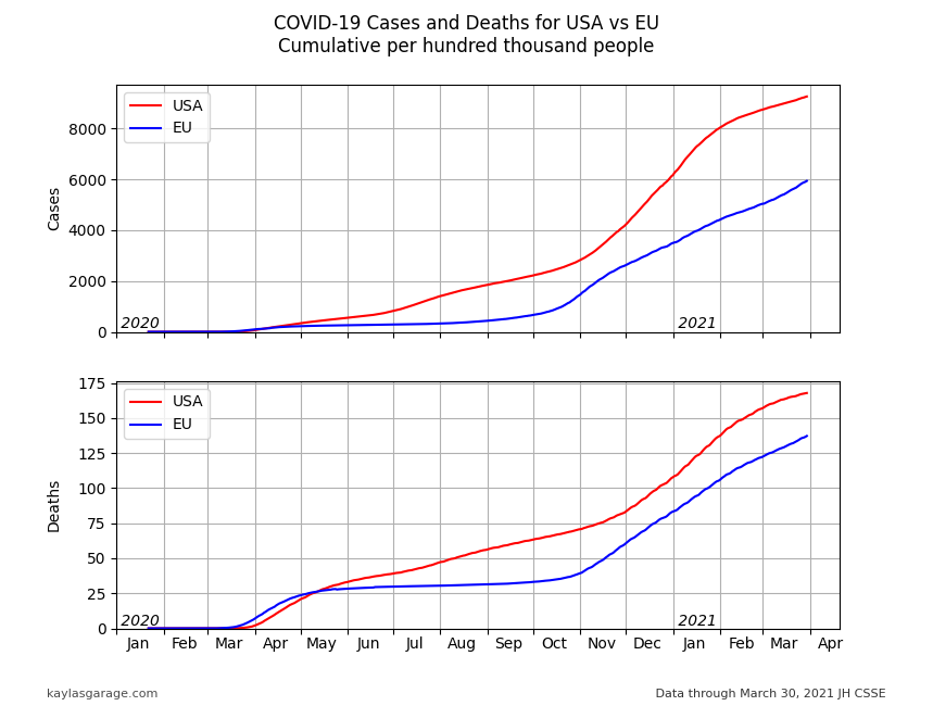
The plots are below are of cumulative cases and deaths per 100,000 people. This gives us the per capita impact.
These plots show that the E.U. is doing a better job at containing the pandemic. The flat curves through the summer of 2020 are illustrative of how mitigation efforts can work.
Based on the numbers below and the relative populations of the regions, The U.S. could have had over 10 million fewer cases and 100,000 fewer deaths if thy had the E.U. trends.
It is hard to say what the latest uptick in cases will bring. On the positive side we have vaccines being rolled out (and the US seems to be getting a head start). On the negative side, new variants are being detected (especially in Europe) and society is balking at the continuing mitigation measures.

The plots below use a log-log scale for a couple of reasons. One reason that is helps show the rate of change, the steeper the curve, the higher the rate of increase. A second reason is that it helps display the wide range of numbers we see as the pandemic evolves.
We would like to see the curves level off and drop steeply as the cases diminish and the pandemic subsides. We can see that this happened in the E.U. 1 x10⁶ (1 million) cases and 100,000 deaths , but then the case rate turned around and jumped up again. We might be seeing the right trend in the U.S., but the uptick in the last few days makes it uncertain.

